
Related resources
Storybook:
AEM components:
- In AEM, Badges and Badge Groups are always used in context of other components, such as Cards, Search results, Heroes, etc.
AEM status:
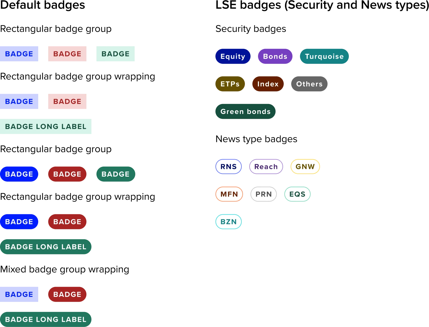
Badge example
Variants and Properties
Default badges : Variants and properties
| Property name | Property type | Description | Values | Default value |
|---|---|---|---|---|
| Style | Variants | Two main types:
| Rounded Rectangle | Rectangle |
| Colour | Variants | Five distinct colours, each representing a different use case. | Blue, Green, Red, Yellow & Grey | Blue |
| Dark Bg | Boolean | Helps badges to have more visibility over their background colour. | True/False | False |
Security badges (LSE) : Variants and properties
These badges are specifically created for particular use-cases and are restricted to internal use within the LSE. They are not meant for external distribution or application beyond the LSE environment or its approved systems.
| Property name | Property type | Description | Values | Default value |
|---|---|---|---|---|
| Type | Variants | Seven types are available, with each one denoting a different aspect of security category in LSE. | Equity, Bonds, Turquoise, ETPs, Index, Others & Green Bonds | Equity |
News badges(LSE) : Variants and properties
These badges are specifically created for particular use-cases and are restricted to internal use within the LSE. They are not meant for external distribution or application beyond the LSE environment or its approved systems.
| Property name | Property type | Description | Values | Default value |
|---|---|---|---|---|
| Type | Variants | Comprises seven types, each representing a different New provider category. | RNS, Reach, GNW, MFN, PRN, EQS & BZN | RNS |
Usage
When to use
Default Badges
Use to highlight essential contextual information about an item.
LSE Badges
These badges are specifically created for particular use-cases and are restricted to internal use within the LSE. They are not meant for external distribution or application beyond the LSE environment or its approved systems.
General Do’s
Use for Highlighting Key Information
Keep it concise, use short text.
Use badge colour Meaningfully.
Maintain clear hierarchy. Ensure the badge doesn’t overpower the primary content.
Ensure Accessibility, provide screen reader support.
General Don’ts
Avoid the usage of LSE badges beyond the LSE environment.
Don’t Overload with Information. Avoid long texts.
Avoid using colours which are not defined or inconsistent in Forge.
Don’t repeat what's already conveyed in nearby text or UI elements.
Don’t use too many badges on a single item.
Usage description of Default badges
Usage description for each color-coded badge in UX, based on common design conventions and accessibility best practices.
| Badge | Best for | Description |
|---|---|---|
| Blue badge | Notifications, software updates, or contextual labels in dashboards. | To draw attention to general information, ongoing processes, or neutral statuses that don't imply success, error, or warning. |
| Green badge | Status indicators, confirmation messages, completion states. | To indicate a successful state, completed task, active/online status, or something verified/approved. |
| Red Badge | Error messages, failed processes, alerts, destructive actions. | To signal an error, urgent issue, failed state, or something requiring immediate attention. |
| Yellow badge | Awaiting confirmation, minor issues, intermediate process steps. | When there’s a warning, an incomplete state, or something that needs user attention but isn’t critical yet. |
| Grey badge | Muted states, system-generated tags, or items not requiring action. | To show a neutral, inactive, or secondary label, especially for disabled or non-primary items. |
| LSE badges (Security & News) | LSE specific targeted functional requirements. | These are designed for LSE and are customised for specific use cases. |
Note to designers
- LSE specific badges are purpose-built for distinct scenarios and intentionally diverge from the default badge colour system.
- It is advisable not to employ LSE badges instead of default badges, except in cases where their use is specifically justified.
Accessibility
Accessibility overview
| Function | Description |
|---|---|
| Reading order | Reading order is left to right then top to bottom unless otherwise specified here. |
| Aria | Avoid using an aria label for badges, let the screen reader access the written text on the badge. if additional context is needed in an aria label seek advice before doing so, if additiional context is required via an aria label then ensure that the aria label follows this format [visible label text] followed by [additional context} |
| Use of color | Any meaning ascribed to the colour of the badge must be communicated by additional means - ideally by the text content of the badge itself. |