Related resources
AEM components:
- Awaiting delivery
AEM status:
Unavailable
Usage
When to use
The options menu is used to provide a short list of options associated with a clearly defined and differentiated content block or section such as a table row or related options inside a content container such as a section frame, or tile card.
The options menu is not intended for use as a standalone component. Where available it is most often included as configurable in context of a broader content grouping.
How to use
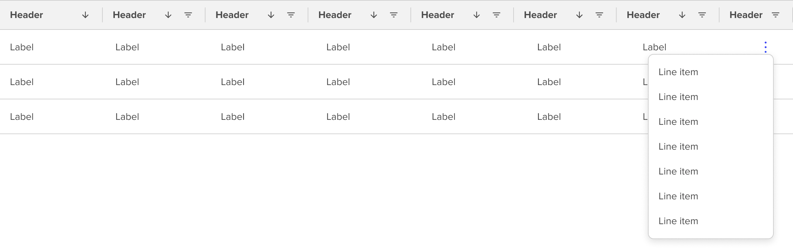
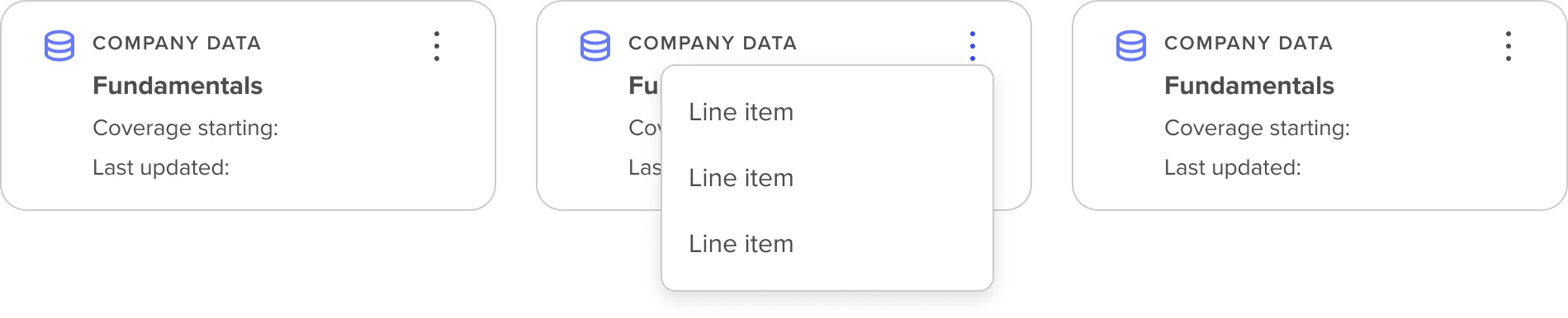
Examples of currently available Options Menus in context include Data Table Rows and Tile Cards. It is recommended to limit the number of options associated with the options menu.
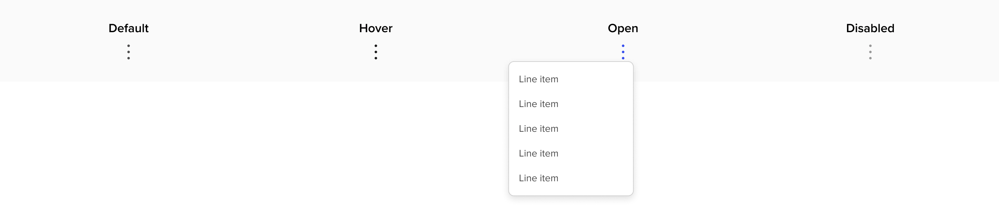
States
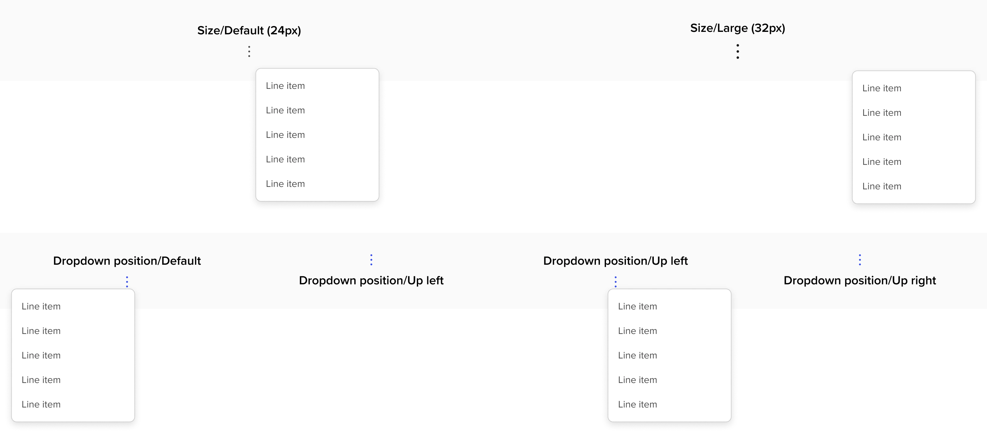
Properties
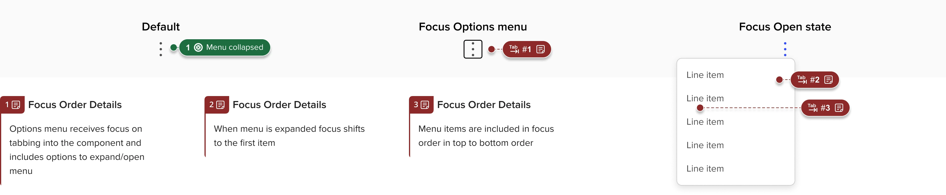
Accessibility
- Use aria described by (for example) to link the label for the kebab menu to the key info in the card that it refers to - there should be an option for any developer using it to choose what field in the card to use for the label.
- Example: if the menu is associated with an alert called “incident alert 12654” then aria described would be something like, 'incident alert 12654 Options menu'