
Related resources
Storybook:
- Awaiting delivery
AEM components:
- Awaiting delivery
AEM status:
Demo
Auxiliary buttons
Download

Account - Logged out

Account - Logged in

Circle

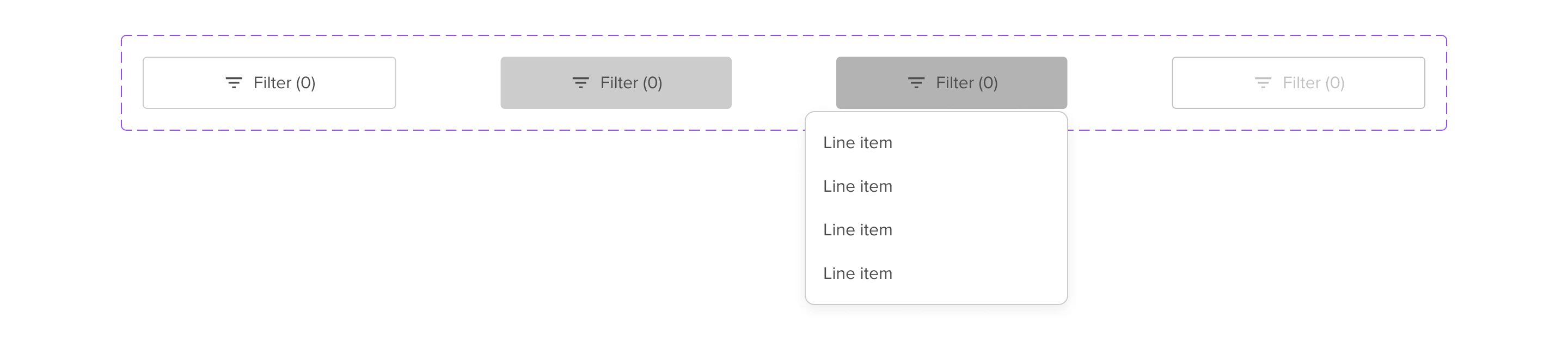
Filter

Variables
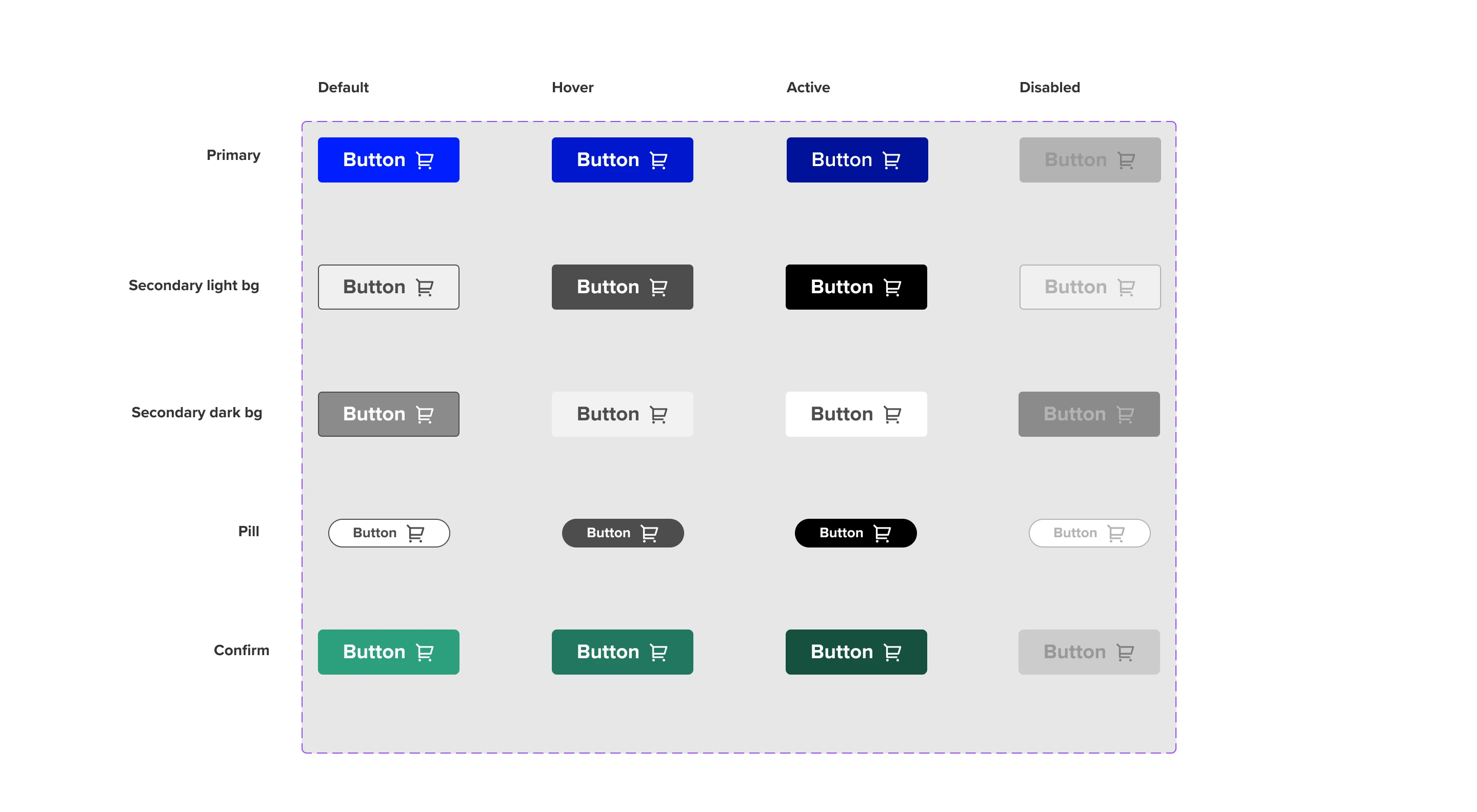
Variables
The buttons look and feel can be changed through the variables that are applied to it. this can be done on the page, artboard, autolayout and component levels to swap styles easily. The available variables and differences are highlighted below. For how to apply the variables in Figma, have a look here
Background
| Name | Marketing | LMDI |
|---|---|---|
| Default | Accent/Solar/500 | Brand/LSEGBlue/500 |
| Hover | Accent/Solar/600 | Brand/LSEGBlue/600 |
| Active | Accent/Solar/700 | Brand/LSEGBlue/700 |
| Disabled | Shade/200 | Shade/200 |
Text
| Name | Marketing | LMDI |
|---|---|---|
| Default | Shade/000 (White) | Shade/000 (White) |
| Disabled | Shade/500 | Shade/500 |
Icons
| Name | Marketing | LMDI |
|---|---|---|
| Default | Shade/000 (White) | Shade/000 (White) |
| Disabled | Shade/500 | Shade/500 |
Usage
When to use
Button’s are our main CTA. We want to use buttons to lead our user’s into the right direction. But of course we don’t know which direction that is and, furthermore these directions are not the same for every user. Check the list below of all variants and a short explaination on when to use which.
Primary
Use when there is a clear call to action on the page. This button should be the most prominent element on the page. When there are more than 2 call to actions on the page consider using links instead.
Secondary
Secondary buttons are used for an action or multiple actions on a page that do not represent the primary goal or action of the page.
Download
Whenever the CTA leads to downloading a document or file, this variant is used.
Account
An account button to sign in and get show account options if you are logged in.
Pagination
Used in page pagination
Filter
Use when there is a clear call to action on the page. This button should be the most prominent element on the page. When there are more than 2 call to actions on the page consider using links instead.
Pill
Used as an utility button to highlight secondary options or the ability to edit sections on the page.
Circle button
Is used in mobile context as a FAB to expand multiple options that must always be visible in the page. It can also be used to add items.
How to use
Buttons are usually placed at the end of content and can be aligned to the left, center and right. They sit below content that support the call to action.


General Do’s
Primary buttons should be the most visually prominent element on the page
Try use icons to draw more attention or convey more meaning
Labels should lead with an action
Provide clarity on where the user is taken
Write in sentence case
Write clear, short, sentences
General Don’ts
Avoid using more than 2 instances of primary button on the same page — instead, use secondary buttons or links
If the purpose of the call to action is to take the user to a destination, consider using a link instead
Try not to rely on the context or surrounding content
Don’t include punctuation