
Related resources
Storybook:
AEM components:
- Awaiting delivery
AEM status:
Overview
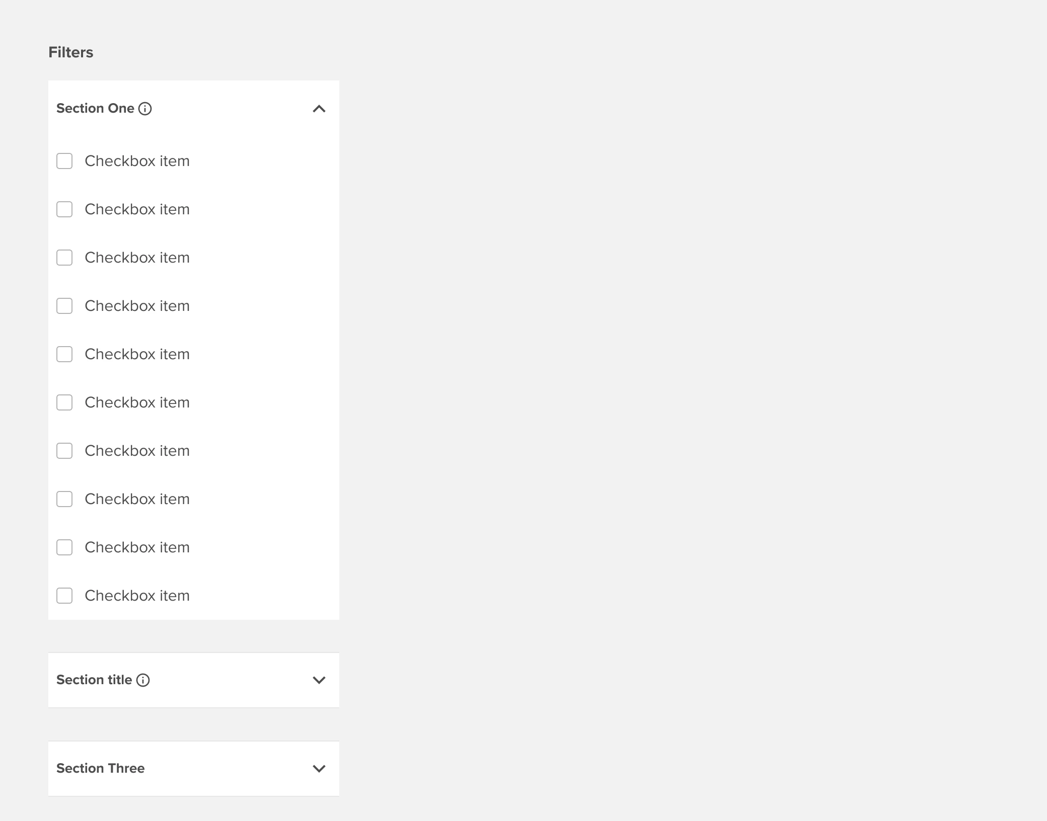
Checkbox filters are used alongside lists of filterable items as in Search Results listings or Data Tables. The core filtering behavior of checkbox filters is that an initial selection narrows results to the selected filter and every subsequent selection expands the filtered view to include results with the added selected filters. Checkbox filters utilize a default “OR” operator within a specific and an “AND” operator across multiple facets: e.g. Country = United Kingdom “OR” France “And” Asset class = Equities “OR” Commodities.
Properties and variants
Search box and Section label tooltip:
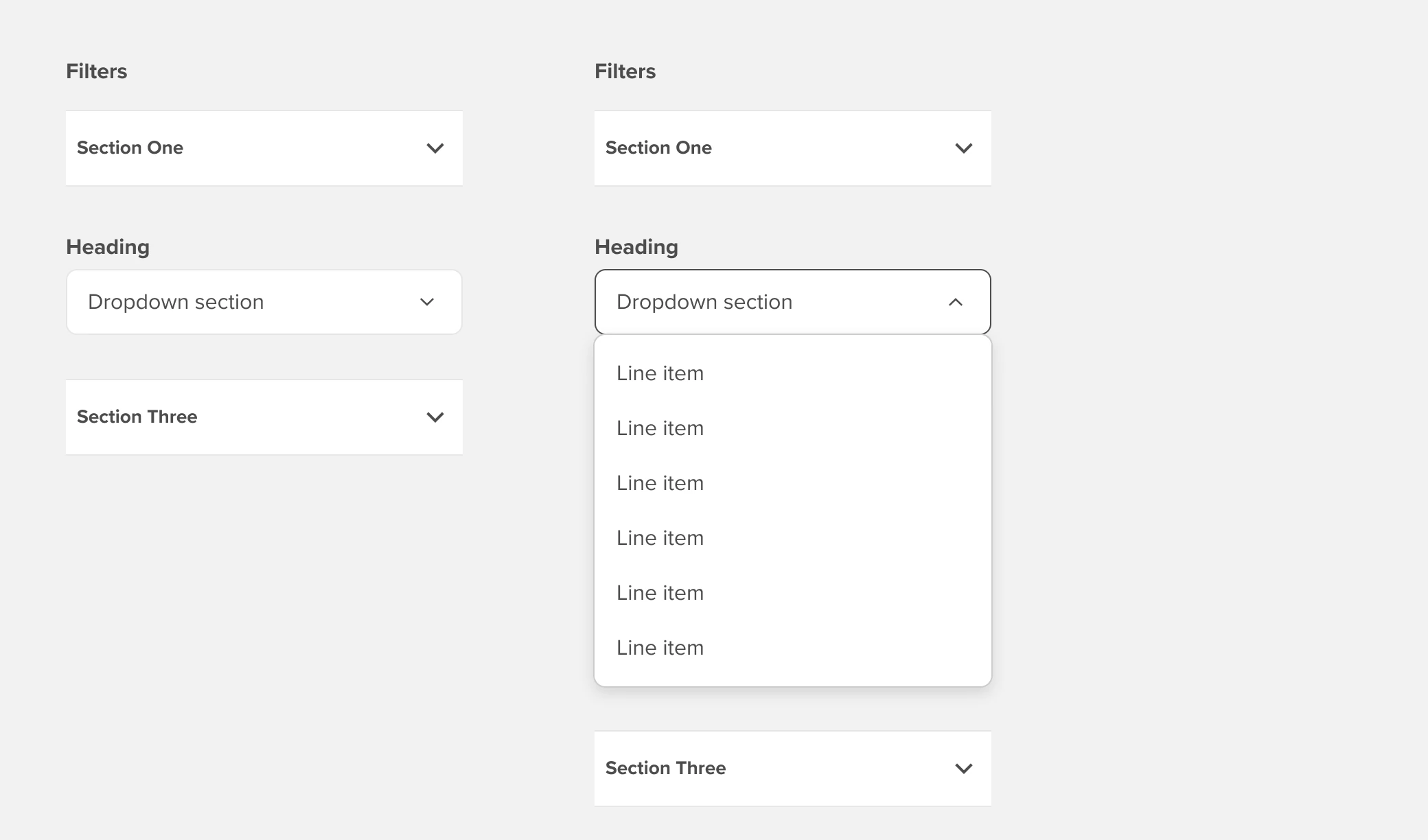
Within expandable sections, there is an option to include a type-ahead search box. Type-ahead search will match characters across all text items in the section and limit the list based on character string matching. Character string matching should include standard items, parent items, and child items including child items that are hidden behind a collapsed parent - retaining the parent item as if the parent and child were one string.
Dropdown list:
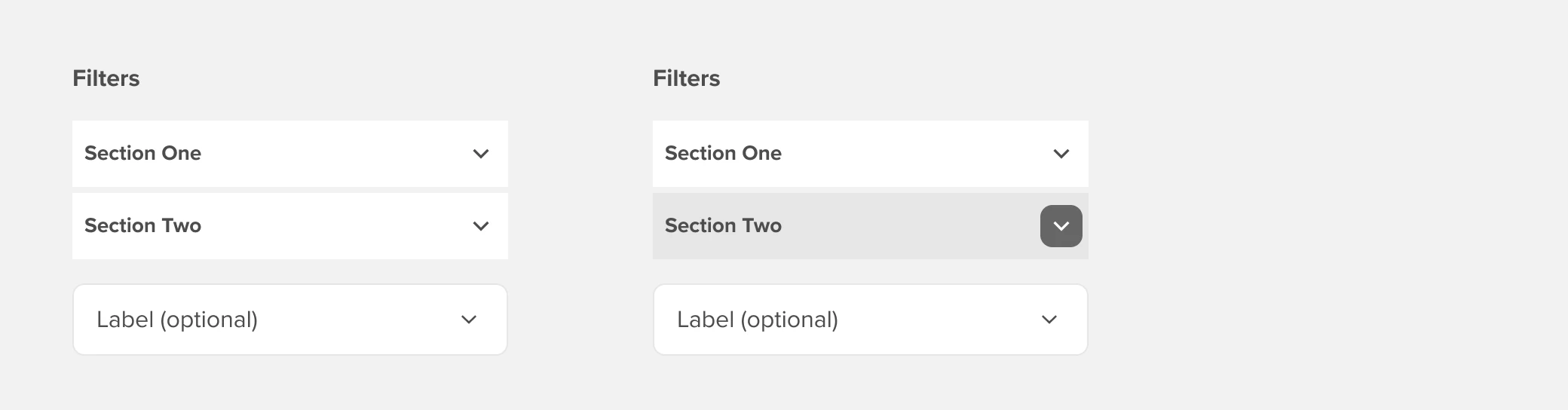
Default filter section (i.e. “facet”) is an expandable list of checkbox filters that support multi-select. In cases where a specific facet needs to be constrained to a single selection there is an option to replace a “Checkbox” section with a dropdown list.
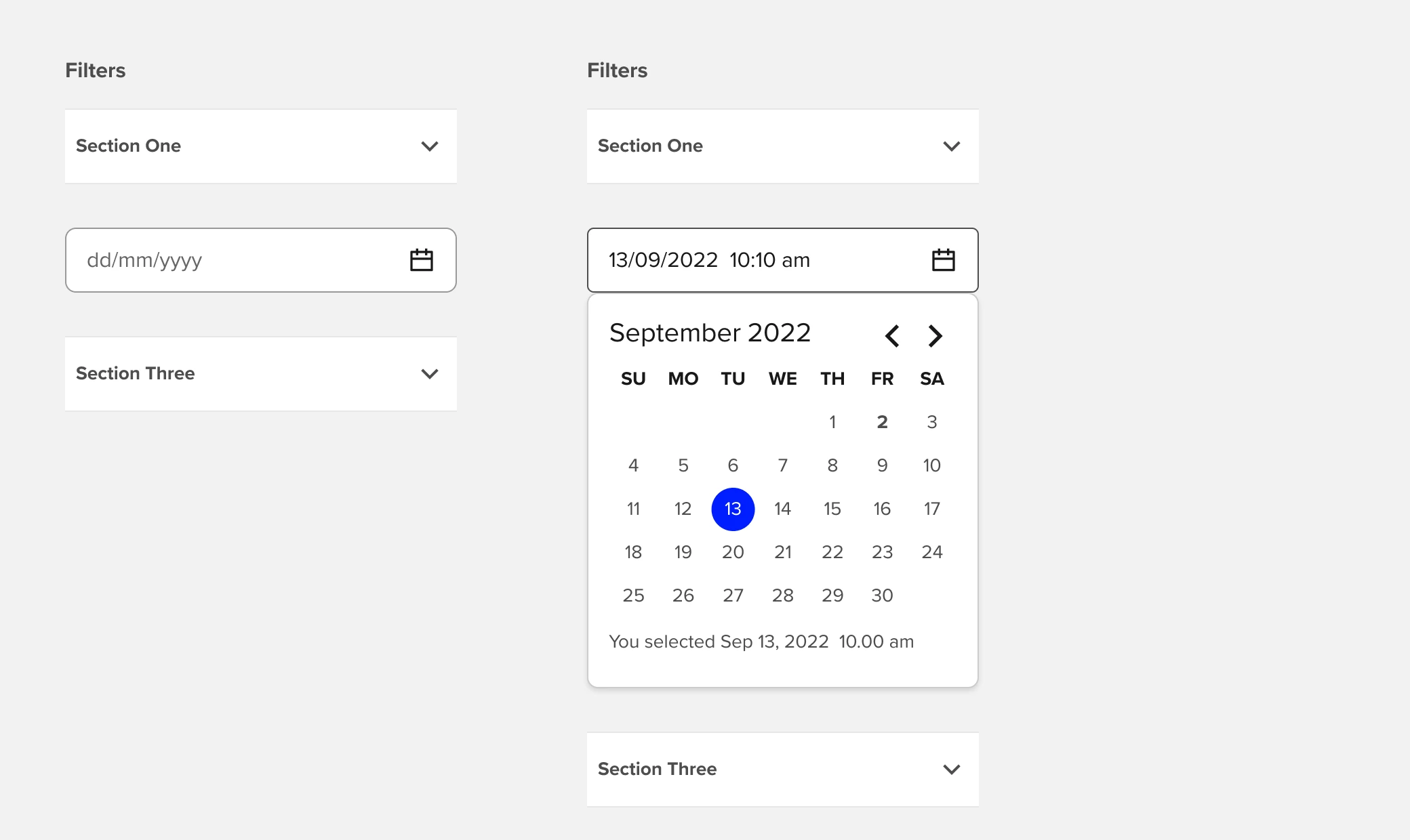
Dropdown calendar:
When a section is utilizing a Dropdown instead of an expandable checkbox section, there is an additional option to change the standard dropdown to a Calendar Date Picker component.
Compact:
A compact variant is available for use in particularly dense filters sets and supports both the Dropdown and Calendar Date Picker section options.
Example

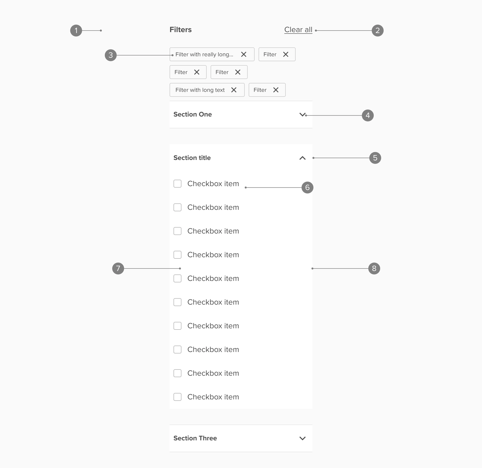
Anatomy

Anatomy overview
| No. | Function | Description |
|---|---|---|
| 1 | Filter header | Includes heading, Clear all fitters actions, and selected filters tiles |
| 2 | Clear all | Only visible after filters have been applied. Includes interactive states per Inline links |
| 3 | Selected filter group | Summary of all currently selected filters. Selected filters are fixed height and hug content horizontally until they truncate at the set label maximum width |
| 4 | Section | Default is an expandable checkbox group. Section can be replaced with a “Dropdown” section |
| 5 | Checkbox item | Whole item is interactive and includes the following states:
|
| 6 | Checkbox parent | Split interactions
|
| 7 | Partially selected group | Parent shows as “partially selected” when a child value is selected but not the whole group. This provides feedback to the user even when the filter group is collapsed |
| 8 | Checkbox child | Indented version of “Checkbox item” with identical behaviors |
| 9 | Dropdown section | Expandable selection is replaced by a Dropdown component |
| 10 | Tooltip (optional) | Gives additional information about the partiparticular tile. |
Accessibility
Accessibility overview
| No. | Function | Description |
|---|---|---|
| 1 | Filter group | Screen readers will announce the section as a filter group and include a skip link that will bypass the filter group |
| 2 | Clear all | When filters are selected “Clear all” appears as an action and will communicate to screen readers that that action will clear all selected filters |
| 3 | Selected filters | Communicated as a selected filter with the filter label announced and that the associated action will deselect the filter |
| 4 | Exandable section has role Listbox | Collapsed and multi-selectable. Selection will expand the list and shift focus to the first list item. Tabbing without selecting/expanding will move to the next section |
| 5 | Expanded section | Focus shifts to the first list item on selection/expansion. Tabbing progresses through the list |
| 6 | List item | Selection applies the checkbox and narrows results. Screen should provide clear guidance on the action: select to apply filter [filter name] |
| 7 | Parent item checkbox | Selection expands switches checkbox to selected and expands the child list. Announced as apply filter [filter name] |
| 8 | Parent item label and dropdown indicator | Selection expands the default collapsed list and shifts focus to the first child list item |