
Related resources
Storybook:
AEM components:
- Awaiting delivery
AEM status:
Demo

Usage
When to use
When you have a piece of content that is too large to show all at once and can be divided into categories. If the content can not be divided into categories, simply placing it underneath each other on the page is also an option, or if the content does not relate, creating different sections is also possible.
Web
A 1440px version and a 1024px of the tabs component based on the current grids we are using. These components can be scaled down to also fit other screen resolutions.
Tablet / Mobile
Secondary buttons are used for an action or multiple actions on a page that do not represent the primary goal or action of the page.
How to use
Tabs are paced at the top of sections so they can divide the content in that section into different categories. Pressing a different tab will change the content shown below.
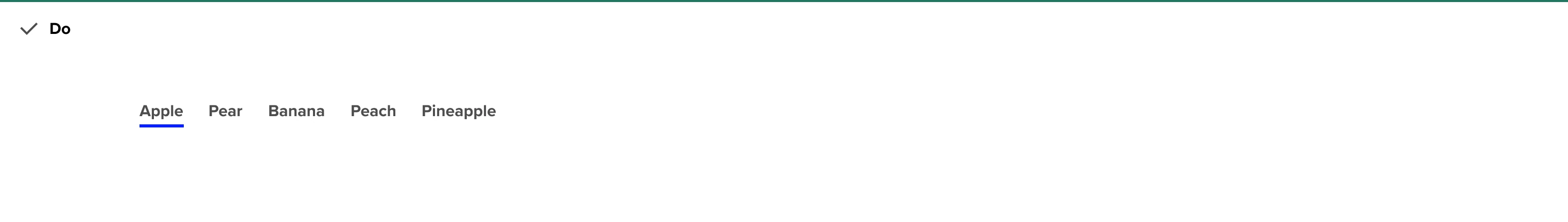
General Do’s
By default the first tab is selected and contains the most important piece of content
Use when placement underneath isn’t possible (because of amount of content for example)
Write clear labels on what the content below will represent
Short words that fit the category
Labels should be descriptive
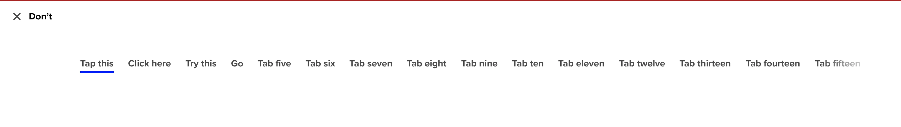
Don’t use twenty tabs in one bar, instead divide content
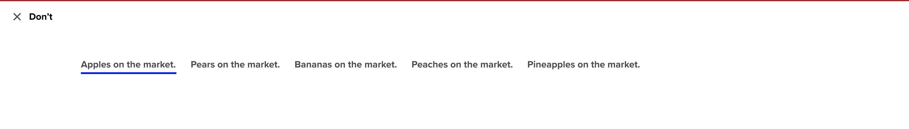
General Don’ts
Avoid using more than 2 instances of primary button on the same page — instead, use secondary buttons or links
If the purpose of the call to action is to take the user to a destination, consider using a link instead
Don’t write long sentence labels
Try and leave out repetitive words
Don’t include punctuation
Example
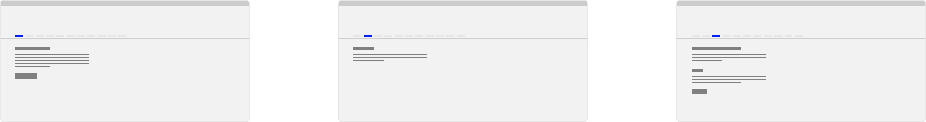
Anatomy
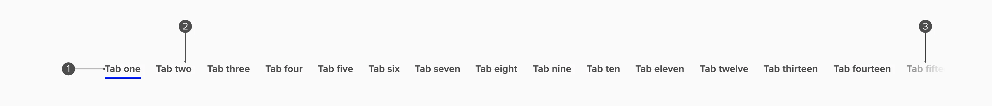
Anatomy overview
| No. | Function | Description |
|---|---|---|
| 1 | Current Tab item | A tab item that is selected (by default the first tab is active) |
| 2 | Inactive tab item | A tab item that has not been selected |
| 3 | Overflow | The tabs bar is scrollable and fades our on the left and right (in the padding) |